post scriptum..

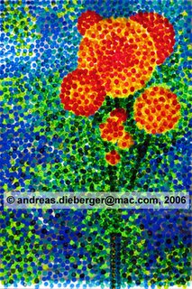
 When I stared at the plexiglass plate over my breakfast muesli I realized more and more that the background was just too overpowering and needed to be toned down a bit. So I went over the thing once more. About 10 different layers of colors later the thing looks like this. Yes, there is definitely layering in these pieces. It's most noticeable if you look at them in reflective light, not when the light shines through them. The trick to control subtle color mixture is to partially overlap the (very evenly sized) dots. By partially overlapping two dots you get three differently colored areas. I typically work from light to dark through the main colors I use on these (light and dark yellow, red, green and blue although on this piece I used also a lot of mixed colors -- the bright background consists of at least 5 different greens). Then I either go the same sequence reverse so that yellow may end up both at the bottom and top. Once through those two series I work less systematically and fine-tune the piece where I feel it needs darkening / lighting up. The whole process involves a lot of squinting to assess light/dark values. On this piece I did something for the first time on an acrylic piece: I used (transparent) black to darken a few spots at the very end. Saurat and friends are probably rotating in their graves right now and will come to haunt me in my sleep... :( But the piece just needed it...

 When I stared at the plexiglass plate over my breakfast muesli I realized more and more that the background was just too overpowering and needed to be toned down a bit. So I went over the thing once more. About 10 different layers of colors later the thing looks like this. Yes, there is definitely layering in these pieces. It's most noticeable if you look at them in reflective light, not when the light shines through them. The trick to control subtle color mixture is to partially overlap the (very evenly sized) dots. By partially overlapping two dots you get three differently colored areas. I typically work from light to dark through the main colors I use on these (light and dark yellow, red, green and blue although on this piece I used also a lot of mixed colors -- the bright background consists of at least 5 different greens). Then I either go the same sequence reverse so that yellow may end up both at the bottom and top. Once through those two series I work less systematically and fine-tune the piece where I feel it needs darkening / lighting up. The whole process involves a lot of squinting to assess light/dark values. On this piece I did something for the first time on an acrylic piece: I used (transparent) black to darken a few spots at the very end. Saurat and friends are probably rotating in their graves right now and will come to haunt me in my sleep... :( But the piece just needed it...
0 Comments:
Post a Comment
<< Home