A different spin...

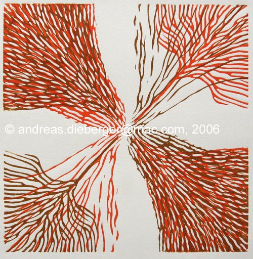 I was busy these last few days because I also finished a print I was working on for quite a while. It's called "A different spin" because it's based on a very simple idea: take one abstract design and print it several times, rotating the plate 90 degrees each time. Of course there are tons of possibilities. Should you use transparent inks? Opaque inks? Go from light to dark or the other way? To play with the idea a bit I actually scanned the first print and then experimented with 4 copies in different photoshop layers, tuning transparency and hues. Very interesting indeed.
Here is the final result. Aaactually, there are two versions of the print because guess what happened... I forgot the print in the scanner (big surprise there, right?). And I noticed this only after I had finished printing the second layer and had completed cleanup. *harumpf* I decided to call it a "lucky accident" and that print got only a second layer, rotated 180 degrees. I really like both versions. The 2-color version has a very different feel to it because two of the four quadrants of the plate were deliberately thinner, and more line based. By rotating the plate 180 degrees you get the two "heavy" and the two "light" quadrants combined which is a very interesting effect that is lost in the 4-color version.
PS: Most of my postings are done using Arial, but this time I'm using Verdana in honor of Matthew Carter. For the letterpress class I will give a short talk about Matthew in two weeks. For those of you who are not into typography: the font Verdana (like many other famous fonts, such as Bell Centennial) was designed by Matthew Carter.
posted by Andreas at 1:34 PM
![]()

0 Comments:
Post a Comment
<< Home