A short update for the short update
In my last post I wrote about the series of three paintings with crosses on them and that I really liked only one of them (that's why I showed only one of them on the blog). What keeps amazing me in the art world is that no matter what I think about pieces I make there is always somebody who really likes a particular piece. (Well, maybe I should rephrase that... I'm sure I also produce stuff that nobody likes but typically the total duds don't ever leave my 'studio'). So what the business of art really boils down to is to match the right piece with the right art-lover (and prospective buyer). Easy, right? Yeah, right. That's why it's called "starving artist" ;)
 But seriously, not all art is great and a stroke of genius. But even these pieces have an audience and very often it's exactly those pieces that friends seem to like best and sometimes even buy first! I'm not sure why that is, but it's a pattern I have seen so often that I start to believe in it. And the argument that "these people just don't know any better" is not valid, because it's often artists who love a piece the artist doesn't exactly love. One theory might be is that we don't like a particular piece quite as much because it is not what we were trying to do with that piece. For instance the artist might go for a specific effect and it doesn't come out quite right. But while focusing on that specific spot in the top left corner of the piece, the art-lover sees the harmonious composition, or is distracted by something particularly well done in the bottom right. Or maybe it just matches his/her sofa particularly well (sorry, couldn't resist).
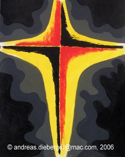
Or it could be that you make a series of pieces and love one of the particularly well and totally overlook that another piece from the same series is quite interesting too...? Well, maybe this is the case here. The cross shown on the left is the second one of the three I mentioned in the earlier post. I still think it is far less interesting than the other one, but - hey - two people have now told me that they like this one much better than the other one. Once I see greenbacks I'll be convinced. In the meantime... here we go. I mean... there are some nice touches on this one too. For insteance, who noticed that there are several faces hiding in the gray surroundings of the cross (ok, with a little bit of phantasy)
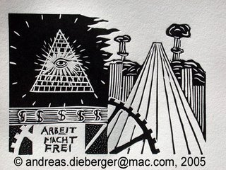
 And as I'm writing all this down, here is another example on the same topic. A couple of months ago I submitted three small prints to the Lessedra Small Print Annual in Sofia, Bulgaria. Two of these prints are on my print page (Lake and Lion). The third print I submitted is interesting, but - well - I didn't put it on my web site for various reasons. But obviously, the folks at the Lessedra gallery thought that this last one must have been the most interesting one, because when they produced the catalog for the exhibit they put that third print into the catalog, and not the other ones (only one image per artist makes it into the catalog, typically). So there you go.
Of course part of the reason I didn't put "Arbeit macht frei" on the site was also that it has sort of a strong message. And I didn't create that print to make a specific political or other statement, but just because I wanted to make something that looked futuristic, technical and contained text using a linocut. So maybe I just felt selfconscious about the piece. Anyway, enough of that, here it is. Let me know what you think - just post comments to the blog. I made that piece over a year ago already, actually and have barely shown it to anybody...
 But seriously, not all art is great and a stroke of genius. But even these pieces have an audience and very often it's exactly those pieces that friends seem to like best and sometimes even buy first! I'm not sure why that is, but it's a pattern I have seen so often that I start to believe in it. And the argument that "these people just don't know any better" is not valid, because it's often artists who love a piece the artist doesn't exactly love. One theory might be is that we don't like a particular piece quite as much because it is not what we were trying to do with that piece. For instance the artist might go for a specific effect and it doesn't come out quite right. But while focusing on that specific spot in the top left corner of the piece, the art-lover sees the harmonious composition, or is distracted by something particularly well done in the bottom right. Or maybe it just matches his/her sofa particularly well (sorry, couldn't resist).
Or it could be that you make a series of pieces and love one of the particularly well and totally overlook that another piece from the same series is quite interesting too...? Well, maybe this is the case here. The cross shown on the left is the second one of the three I mentioned in the earlier post. I still think it is far less interesting than the other one, but - hey - two people have now told me that they like this one much better than the other one. Once I see greenbacks I'll be convinced. In the meantime... here we go. I mean... there are some nice touches on this one too. For insteance, who noticed that there are several faces hiding in the gray surroundings of the cross (ok, with a little bit of phantasy)
 And as I'm writing all this down, here is another example on the same topic. A couple of months ago I submitted three small prints to the Lessedra Small Print Annual in Sofia, Bulgaria. Two of these prints are on my print page (Lake and Lion). The third print I submitted is interesting, but - well - I didn't put it on my web site for various reasons. But obviously, the folks at the Lessedra gallery thought that this last one must have been the most interesting one, because when they produced the catalog for the exhibit they put that third print into the catalog, and not the other ones (only one image per artist makes it into the catalog, typically). So there you go.
Of course part of the reason I didn't put "Arbeit macht frei" on the site was also that it has sort of a strong message. And I didn't create that print to make a specific political or other statement, but just because I wanted to make something that looked futuristic, technical and contained text using a linocut. So maybe I just felt selfconscious about the piece. Anyway, enough of that, here it is. Let me know what you think - just post comments to the blog. I made that piece over a year ago already, actually and have barely shown it to anybody...

1 Comments:
Hey Andrew! I extremely like your 2 crossy pieces on your Blog, and imagine several ones of them together side by side. Beautiful vision. Greetings from starving artist to starving artist :-) Karin
Post a Comment
<< Home