Topology
 Update: Auction site is up: http://www.workssanjose.org/auction2006.shtml
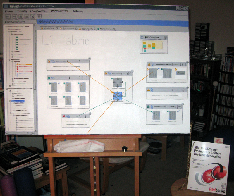
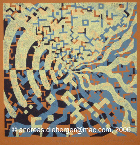
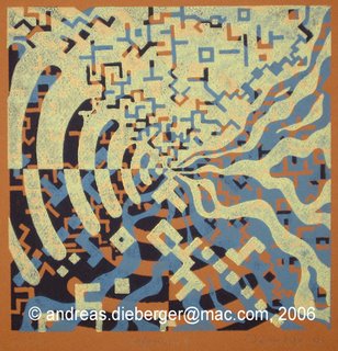
When I returned to my job in Silicon Valley, after spending a blissful year at art school, people often asked me what I was planning to do with what I learnt during that year. Being a user interface design person I jokingly answered that I would deliver my next UI design document as an oil painting. Sadly, it never happened quite that way, but earlier this year I made good on my threat and created a painted version of one of my design sketches for the TPC 3.1 Topology viewer as an acrylic painting. It got me a very good laugh when I showed the piece at the art show in our lab.
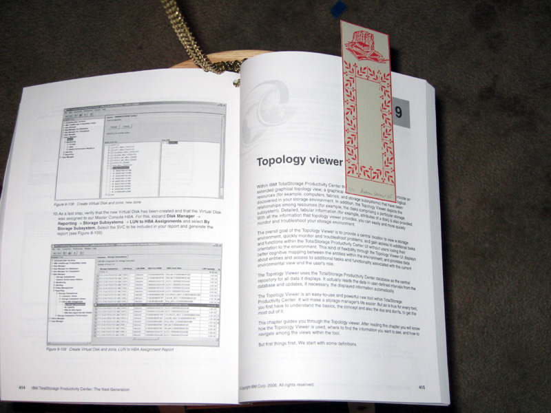
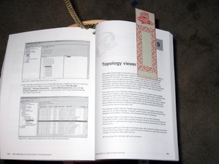
Recently, I decided I'd donate the piece to the upcoming Works San Jose benefit auction. As the official manual for the product had just been released I thought it would be a cool idea to give a copy of the book to the buyer. Then the gears in my head started spinning and the result is this installation version of the topology painting, which will be on the block at the Works San Jose auction: The manual, chained to the painting with a bookmark in the chapter on the topology viewer. The bookmark is a limited edition print. (Or is the painting chained to the manual...? Hard to tell)
 The more I think about this combination the more hilarious and appropriate I find this combination of objects. First: not too many paintings can claim to come with their own 500+ page user manual! And it's very appropriate that a painting that comes out of silicon valley and depicts a piece of software actually needs a user manual - especially a 500+ page one! And then there is the strange contradition of having a limited edition print bookmark in a mass produced manual on an even more mass produced piece of software. Don't even get me started about how appropriate a marriage of high tech, low tech and art this really is...
 More information on the works auction is here: http://www.workssanjose.org/
The auction preview show will run from 11/21/06 - 12/02/06. The auction is on 12/02/06.
-----
Artist Statement for "Topology"
When I returned to my high-tech job in Silicon Valley after spending a blissful year at art school, people often asked me what I was planning to do with what I had learnt during that year. Being a user interface and interaction designer I jokingly answered that I would deliver my next user interface design as an oil painting. Sadly, it never happened quite that way, but eventually I made good on my threat and created a painted version of one of my design sketches for the product we were about to ship. The painting shows an abstracted image of a storage topology viewer. I put the piece into a company internal art show so that people would go “What the…?” as they enter the gallery, thinking somebody had just posted a printout. Only when walking closer would they notice they were actually looking at a painting of a screenshot. It worked well and got me a good number of laughs.
The recent release of the “Redbook”, a book-size manual for the product, provided the opportunity to take the piece a step further, beyond the quick practical joke. Software products – especially in the space of storage administration – are so complex that it is utterly impossible to do anything useful with them without special training and thick manuals. Similarly, the screenshot shown in this piece might look fun but is quite meaningless to the uninitiated. By chaining the actual manual for the software, containing an entire chapter just on the use of the topology viewer to the painting showing the topology viewer, I point at how users depend on help and instruction to actually understand the piece. Not too many paintings can claim they come with a 500+ page user manual. In a sense this is a very appropriate piece of art to come out of silicon valley.
The fact that it is a painting that is chained to the manual (or is it the other way round?), with a limited edition print used as bookmark in the topology chapter highlights similarities and discrepancies between the art and high-tech worlds: The art world is concerned with permanence and durability of the piece; really this is not too different from the storage system world where the main goal is to safely and reliably store information for long periods of time. At the same time, the software product itself, and most of the output of silicon valley is extremely short lived. Typically people working on a product are actively working on at least the next version of it, or even an entirely different product before this one actually ships.
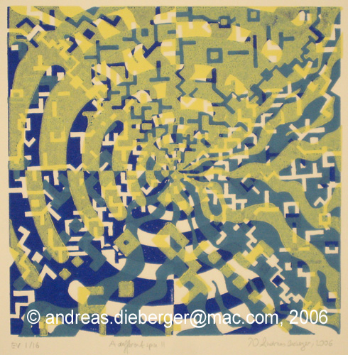
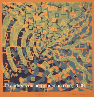
A Different Spin II
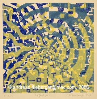
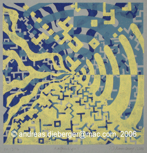
 A couple of months ago I experimented with a print that consisted of just one, square, linoleum plate printed in 4 different colors, but rotated 90 degrees each time. The print is shown on my printmaking art page. I thought the result was so interesting that I had to do another one and this one became even more interesting! In an outburst of creativity, I called this second experiment "A different spin #2".
There are a couple of things that are very different about this print. First of all I planned a lot more, and drew a whole series of sketches. Also I wanted to have two very different types of cutting on the print in different quadrants: 2 quadrants with more rounded forms, the other two with very line-like forms, with exact angles and lines. This part was quite difficult to cut because I also wanted exact 90deg angles for all the corners of the lines. That was a lot of work (I had to precut all the lines with a straight blade and then carefully lift out the linoleum. Normally I do that only for a few special spots on a plate, not for a majority of all lines. But the results show that it was worth the effort.
 This one is also done with only one plate, however it's a 3 color print. Which leaves 2 possibilities for the last plate, right? As I couldn't decide which one I liked better, I just printed a few of each. And then I made a few prints on different color paper (3 different paper colors) which means there are really 8 variants of this print depending on paper color and the orientation of the last plate. The print is numbered as EV (Edition Variee) for that reason.
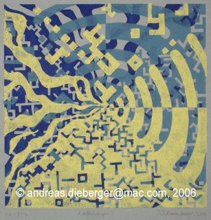 Here are a few photos of some of the variants. Note the I used exactly the same inks for each of the prints and it is really quite amazing just how different the prints look - the various paper colors make a huge difference and the orientation of the last plate does as well... By the way: this is probably the last print I printed on my old, small press. All the new prints from now on will come from the new press I described in the previous post...
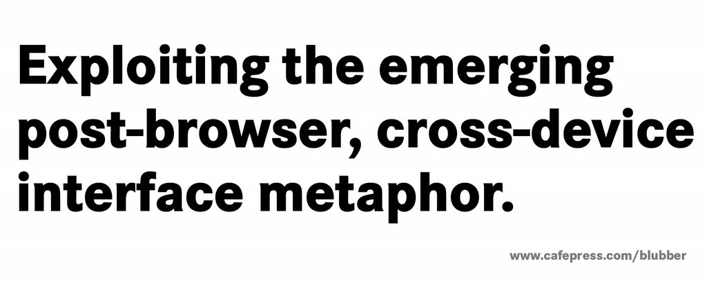
 Most visitors to my art web site have probably had a look at the "store" page, which links to a cafepress page with a few shirts and cards with some of my paintings on them. But wait, there is more! I actually have a whole list of cafepress stores with various items on them. I didn't link to them from my art site because - well - some of them are maybe a bit too off-color humor for some tastes? But then, how would I know for sure if I didn't just let the cat out of the sack? So... here is the complete list of stores I have right now with all the various kinds of humor that are available there right now. Enjoy!
 The Jumping Peanut too - Tshirts with slightly (?) off-color humor. A subset of another earlier store I used to have.