Puzzle-print!
 First of all - a reminder that this week and only this week I am showing 6 prints at a SJSU show. Gallery 3, art building, San Jose State. Reception is Tuesday night. Here is a photo of the 6 pieces I'll show there. Among them the print I'm discussing in this blog posting. See also previous blog post. It's a really beautiful show - not just because I have stuff in it, but because it's all really really good work. Here is a photo of the setup in my corner. The lighting hasn't been finalized in that photo yet, obviously. Anyway, come by and check it out live! 'nuff said.
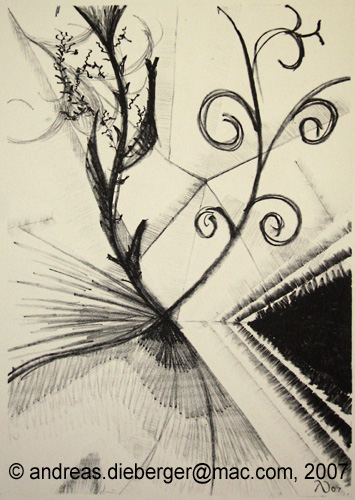
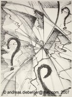
OK, and now for the actual blog posting. It is about the second piece on the left in this lineup. It is one of the most tricky and often frustrating challenges in printmaking to get plates perfectly registered when you create a multi-color print. Just the tiniest mistake can very much disturb and destroy the resulting print. And sometimes it's not even the printmaker's fault because paper can change size a bit based on humidity and 100s of other factors. Multi-color prints typically are printed in several steps that are printed on top of each other. Typically, but not always. That's because there are other techniques to create multi-color, such as chine-collee (colored paper collaged to the print), "a la poupee" where parts of the plate are manually inked in different colors, "iris prints" or rainbow prints where you print a transation from one color to another in one layer and several others.
 And then there is a technique which I call "puzzle print" although I'm sure that is the official term. The idea is that the printing plate gets cut into smaller pieces. These are inked individually, then put together like a puzzle and then printed. Rinse and repeat. This posting describes my experiences with this technique.
It sounds very simple, and in principle it is. However, the devel is in the detail, as so often. I didn't want to do a super simple puzzle print: I wanted a complex shape. I soon learnt that this is not so easy with the tools I had at home. After some discussion with my friend Bernie who is an expert in wood working (see Bernie's site) I learnt about the difference between a jig-saw, a coping-saw and a fret-saw. I had the first and the second, but not the third. And of course that was what I needed. Problem is: these things are sorta hard to find! The guy at home depot didn't even know what a fret-saw was supposed to look like! (it's a bit like a coping saw, but with much much thinner blades). Eventually it dawned on me that a fret saw is what we would call a "Laubsaege" in German. I had used one of these as a kid, like 30 years ago and hadn't seen one since... Eventually I tracked down a source for a fret saw and they even had one in stock. Oh, heck why not send these guys some traffic: Check out the Sawdust shop here in San Jose.
 So now I had all the parts I needed (and I even aquired a set of kevlar gloves for woodcutting, in the process - very handy - pun intended). I sketched out my design and then came the next problem... Cut the plates first or saw the plates into puzzle pieces first? It was late at night when I faced that decision and I didn't want to wait to call Bernie so I decided to saw the plate apart first (I really wanted to try that fret saw ;) ). In hindsight that was the second best way to do it (out of two possibilities). The reason is, that my design had a few very small and narrow spots and it was much harder to cut the design on those pieces because I couldn't really hold the plate well. Oh well, live and learn.
Next I cut the design which came out quite nicely. Once I had all of this cut, I almost didn't want to print this because the plate pieces by themselves could go as pieces of art! My idea was to mount them, with padding of different height behind them in a shadow-box, illuminate at an angle and you would get a really nice 3-dimensional art piece. Now if I printed that stuff, the ink would get into the fine pores of the plate and I will never really get it entirely out again. The effect of the wood-relief would be gone. I was tinkering with that problem for quite a while. Eventually I decided to print the plates anyway but to seal them really well with shellac: the oil paints can be cleaned off with vegetable oil or turps which doesn't affect the shellac, because that gets dissolved by alcohol, not by turps or mineral spirits (Bernie's suggestion again - this man is a genius!)
 The resulting print came out nicely and I'm glad I chose the relatively muted combination of colors you see in the final print. So what about the plates? Well... the experiment worked almost as well as hoped, but not 100%... there must have been a few micro-cracks in the shellac because in a few places there are traces of the ink on the plate that just don't come off. I might still go with the idea to mount the plates as a separate art piece. Or I'll just make a new set of plates. Oh well.
Now about the prints: the 4 plate pieces registered perfectly. No sliding around and the colors just printed nice an evenly. BUT: don't do fancy puzzle shapes like I did. BIG MISTAKE! It turned out that it was a friggin nightmare to actually put the puzzle together before each print!!! You cannot just slide them into each other, instead you have to carefully angle one plate in, let it drop in place, maybe even push it in with the corner of a spatula. The same in reverse for taking it apart. And try doing that with ink all over the plates when the plates are only 1/4 inch thick and must not touch and smear each other's surfaces that have different colors on them. Right? So that was a bit of a nightmare, but in the end it worked out OK and I got a set of beautiful prints. But next time, I'll make sure the pieces fit together easier!
Showing at SJSU - how's that for a birthday present?
So yesterday I slave away (just kidding) on a lithograph which didn't work out at all (unfortunately not kidding on that part). Suddenly I get asked if I'd like to be part of the little show some of the printmakers are putting on for next week, because they don't have any relief prints in the show yet and stuff. Oh, and the stuff should be up *tomorrow*. Erm... YES!
How about that for short notice? Well after some more talk we figured out I can get the stuff in there Saturday afternoon but it's still a bit of a mad rush because I don't want to just put my stuff up with push pins but have them framed. Luckily I have all the materials (minus mat boards which I bought today in the morning) at home. So tonight and tomorrow will be a framing session. I have 6 pieces and need to frame 4 of them. And because I'm a perfectionist... well you get the picture. I don't know yet if I'll actually hang all 6 pieces, because I don't know if that will work space wise. But I want them ready in case there is enough space.
The show will be up all of next week in Gallery 3 (downstairs) in the Art building at San Jose State University. The official opening / reception of the show is Tuesday, February 27th from 6:30 pm till 8pm-ish. There will be some food but as this is at a school, food doesn't last long, typically. I hope I'll see you there!
Here is a campus map if you've never been there. The Art building is in coordinates C3-C4 on that map. The campus hugs the corner of San Fernando Str and 10th Str in downtown San Jose.
A long overdue print
 This weekend I finally found time to print a bit at home (as opposed to the printing I'm doing at school lately). This particular print is long overdue, as I started working on it when I was last in Austria, which was in September. The print came out of a joint printing / art session with my friend Karin (see link to her blog on the side).
During that session I cut one plate completely and the other one mostly and pulled one test print of one of the plates. But I was never really happy with the result. My idea was to cut both plates in Lauan wood which has a very strong grain as is clearly visible in this print. This can be beautiful but - well - it's really a LOT of grain. And I wanted to see what it would look like if both plates are done on such strong grain. Well, to be honest with you - I think it would have been better if one of the plates (background most likely) would have been on a smoother wood - it would make the print look a bit more solid. But what is done is done. It's still an interesting piece. But back to the story. Originally this print had a "rainbow print" background (sometimes also called "iris print" I think. It's a color transition, in this case from yellow to red) and it also had a large sun in it. Eventually I decided to get rid of the sun and I also did some more cutting behind the tree trunks (before there was almost no cutting in the background plate in that area so I would have a solidly printing background for the iris print. Also the first version had no clouds (as so often, when there are clouds, the sun goes away, right? ;) ) Instead of bright yellow and red, this version is printed in yellow ocher and indian red on off-white paper.
Blogger changes and more bottles
 Harumphf - so they finally forced me to switch to a google account for this blog. I really wanted to keep my old blogger account. Not happy. I don't like to be forced.
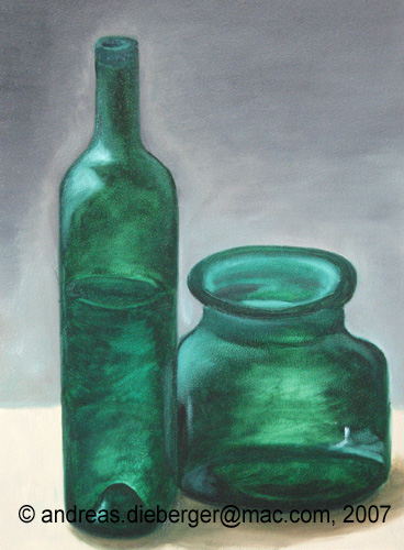
On related news... This was pretty much an off-week for me. Nothing worked well, in particular not the painting I did. We did bottle still lives and I think the results were pathetic. Yes, it's recognizable as bottle and there is even some transparency, but this piece is definitely not on the same level as my other work. Must be that slump you get into when you work pretty well for a while.
Bottles!
 Today we continued our exploration of still lives by introducing transparency. The goal was to paint a nice, realistic looking bottle. I tried to be ambitious and went for two. I didn't have such a great day though and the result is - well - soso. It's not completely horrible, but it's not really good either. Everybody has an off day every now and then. If I have the time I might go in and fix the piece, but then, I might just make a new one.
Don Feasel did a splendid demo again at the beginning and he just created a very realistic bottle in almost no time. It was a joy watching him work on that thing...
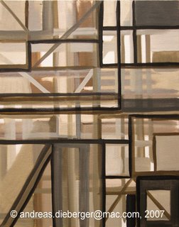
Grid-a-palooza?
 Remember the grid exercises from a week ago? Well, I liked the exercise so much that I decided to do one of these in large, which means 40" x 30". And because I often combine multiple experiments into on, I used a canvas I had not primed but just sized with PVA glue (just for the record: the size is there to protect the fabric from the linseed oil which is acidic and destroys the fabric over time, that's why you can paint with acrylics directly on textiles, but it's not such a good idea to do the same with oils).
So why not prime it? Because priming changes the color and I wanted to keep the feel of the unmodified support (yes there are other ways, such as transparent gesso but that has yet other issues - such as the discovery that oil doesn't adhere to acrylic paint quite as well as some people think - it's the physical bond (adhesion) vs. chemical bond thing). Hmmm... am I deep-ending here again?
Anyway, here is that grid exercise, done in oils on cotton canvas that has just a sizing layer. What I noticed that the support is super absorbant! It sucked away oil and medium like you wouldn't believe. And some of the color struck through to the back of the piece (note to self: next time: one more layer of size!!) But it's a neat piece because I kept the original tone of the canvas as part of the composition. Which means that the white areas are painted, but some of the mid tones are not. The composition is a bit flatter than the other exercises I did and maybe I'll take it out again some time and work more on it, but for now I'm happy with the piece.
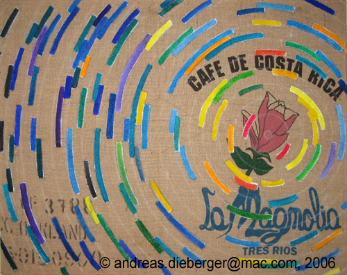
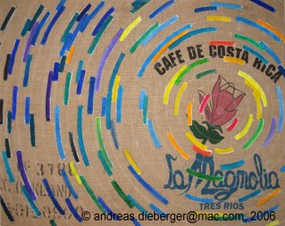 I also decided to set aside the latest piece on coffee bag I was laboring over for quite a while. I don't think it's done but I just don't see how to proceed right now, so it's hanging on the wall waiting for some inspiration. This one is done in acrylics on coffee bag (burlap). No sizing necessary there! The benefit of that is that the burlap stays nice and smooth and soft. When you size it, it gets harder which I don't like as much. I like to maintain the tactile soft quality of the material. This piece is - by the way - the largest painting I have done so far - ever. It is 36" x 46".
Lithography update
Didn't I say I'm doing painting AND lithography this semester? What happened with that? Well, glad you asked... This week I was finally ready to print something. I was working on two "test plates" for last week or so. I call them test prints because they don't even try to be exciting pieces of art. Rather I'm trying to understand the medium better, and to get a feel for the softness/hardness of the various crayons and pencils, learn to cope with very dark and very light lines etc etc. For that reason my first places are really pretty brutal applications of crayon to get really heavy dark right next to very subtle shades and such... and to hopefully learn how to print these (which is not quite so easy as everybody can tell who has ever tried lithography).
 Also, we are using alumium plates for lithography, not the stones (at least at this point). So that's a slightly new medium for me. I have done litho once before (3 years ago) and then I did work on stone. Also, then I had a master printer help me out with every move which was very convenient. Now I do have some support but in essence I have to do most of the work myself... (how else would I learn it, right?)
So here is the first plate I did. I printed that one on monday and it came out soso. Actually, that print was a total disaster at first. Nothing worked. Till we figured out that my press had waaay too little pressure on (and I just though the weight training had finally paid off). After somebody cranked up the press pressure the last 3 prints came out semi-OK.
As I said, not exactly a great piece of art.
 Now for that second plate I was working on. On this one I pushed the light/dark contrasts even further with fully saturated black and really really light shades done with a #5 litho pencil. And to make things really challenging... I was all by myself when I printed that plate. There was literally nobody else there so I couldn't even ask if I would run into a problem or if I didn't find supplies or whatever. It just had to cope with the situation myself. Well, luckily no emergencies occurred and the print came out quite well, actually. I'm really happy that I succeeded in printing this all by myself (with just the help of one piece of paper - yeah!)
Here is the final result. I printed this one on 4 different paper colors to check a) how consistently I would be able to print this thing (well, semi consistenly would be my assessment of that part) and b) how much paper color would impact the look of the print. And indeed that made quite a difference, especially in the super light shades (see those straight edges in the background. Those were the main challenge so I wouldn't lose those, and at the same time not to totally over-ink the pitch black triangle in the bottom right.
Overall I am very happy with how this print came out and I'm totally jazzed that I went through the whole procedure all by myself (somebody who has never tried lithography probably cannot fully appreciate why I'm so excited about this). Anyway, the next step will be to make actually some interesting print, just an experiment. Stay tuned!
News from the potatoe front...
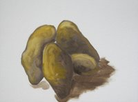
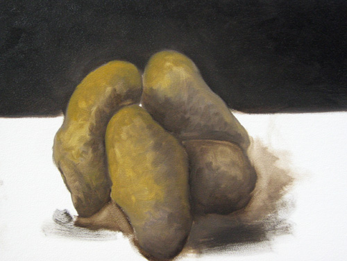
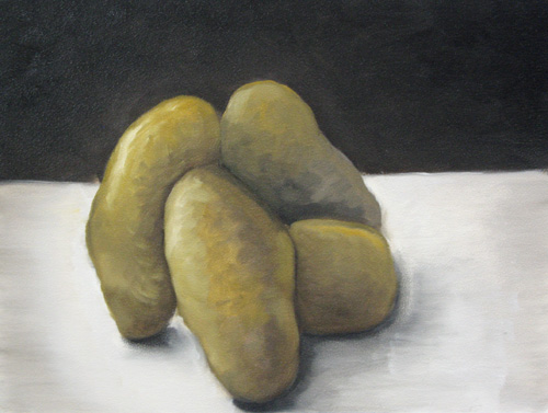
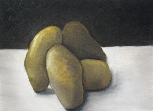
Surprise... more potatoes!
... quite literally (because last time it was one lonely potatoe. Now the spud brigade is marching in in full strength - well, four is a crowd or such?) Well, I'm really tired, as are my jokes I guess after this really intense and exhausting day. But I - must - post - to - blog - otherwise - lydia - will - out-post - me - again!
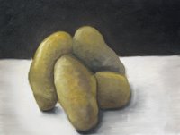
So the key thing to learn in a still life with more than one - erm - potatoe, is to make them sit properly in space, to create the impression of depth. All the tricks from the last potatoe post still apply, only now there are several. So, start by blocking out the group-shape. Then after the individual shapes are sorta defined, there are some of the same tricks as described for making the shadow under the spud. Only the trick is tweaked for making correct shadows between the various potatoes.
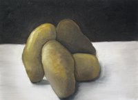
So to do that you look at the edges where one potatoe becomes another potato, so to speak. Determine, which side of the edge is the lighter one - act accordingly. If you need a shadow (dark area) work pretty much like with the shadow on the single potatoe - make the strong line of darkness and then work the potatoe shape into that shadow area. It's really exactly the same idea, only now there are different levels of darkness because you are casting shadows on the other potatoe, for instance. Rinse and repeat for all edges. Then do it again because you probably messed up the lightness values somewhere. It's fascinating that if you keep doing that you actually get a decent looking still life. We didn't have to make a dark background today, but I did anyway.
Overall I"m not super happy with the outcome of this one. If I have the time I might take it out again next week and fix a few of the things that bug me. I'm too tired to photoshop my copyright into all those images, so here they are just like that for a change.
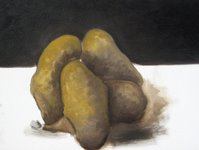
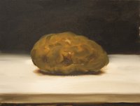
Hail to the potato master!
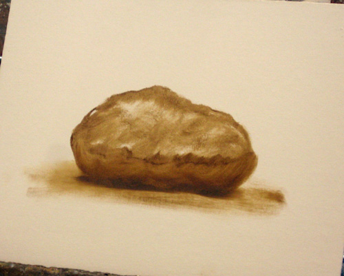
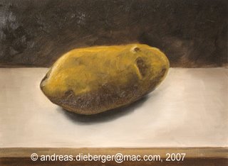
Today we started working on still lives. An excellent exercise for that is to paint potatoes. Don Feasel pointed at Van Gogh as the true potatoe master and who would argue stepping in VanGogh's footsteps? So potatoes it is. They are actually quite interesting to paint. Don Feasel gave us a really impressive painting demo at the beginning of class where he just whipped out a potato still live in - erm - 10-15 minutes tops. I snapped a few photos along the way and here they are (posted with Don Feasel's permission, of course). At the very bottom of the page you can see the results of my very own efforts of pulling off the same. Of course it took me like 1.5 hours to get to this point, not 10 minutes... (sorry about the inconsistent lighting - I had to take most photos at an awkward angle) The key to a still life like this is to realize that there are a number of tricks of the trade. So first you just whip out a potato shape just like that (yeah right, "just like that"). Don't put it too high or too low. Don used relatively short strokes to sketch this thing. It's done mostly in Raw Umber with some white at this point. Then he put in a bit of a shadow. The main danger in this phase is to create a "levitating object". YOu need to ground the thing to keep it put. Another key point at this phase is to not pay too much attention to the object itself, but more to the surroundings. The details of the potato get filled in at the very end - the surroundings count now. Now about that shadow. It sort of works but just not enough. It is really just a rough sketch itself right now.
 We need to make a real shadow. Don makes a relatively brutal stroke over that bottom edge of the potato. I think he even used black for that. Then he starts working the potato back into that black bar. By moving the paint into the black bar you get the right transition between the potato itself and the darkest part of the shadow. The same is used to express roundness of the object: put the darkest parts down first and then manipulate the light colors into that dark area.
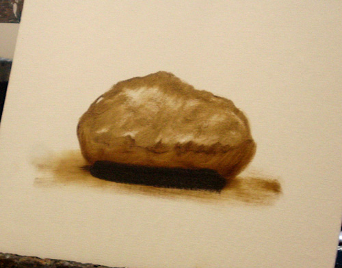
 ...as can be seen here. The drop shadow works really well now and the form of the potato is nice and round and much smoother. In a few places, Don set areas of light ochre.
  Now the interesting next step: put a dark background in. In still life this is called a "traditional spanish background". Start more or less with black at the far end and slightly lighten the background towards the object itself. Note that the background can be shown as a line now, because like with the shadow, we'll work the object into the background to create the right transition between object and background. Once that happens, the hardest edge becomes the object edge (see next image). For the horizon line we'll just do a horizontal line. Don't put it too low otherwise the potato will appear to ride like a ship on the horizon.
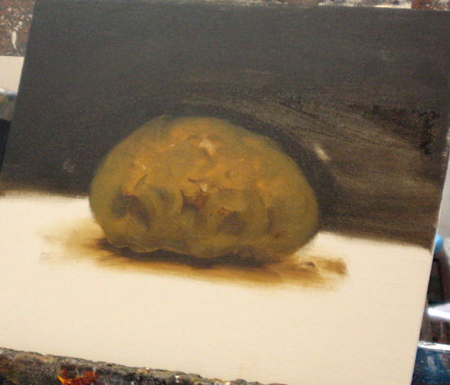
 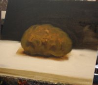 Start building the table top. Essentially Don just put a thick layer of white down and then moved paint from the shadow into the white and the other way round (using a rag). Then also move some value from the side edges towards the object to focus light on it. To make the table be more in the distance, create a table edge in the foreground. To make the edge a bit more interesting, don't keep it a bit varied in value, not all just a stroke of the same color. Continue darkening the background towards black, but also here keep some light around the object to focus attention on it.
 Voila, the final piece. Pretty impressive for 15 or so minutes...
And here is my own piece:
Another grid exercise piece
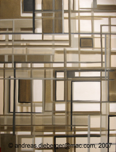
 I started working on a few more of these grid exercise pieces on my own, because I think this is a really good and interesting exercise for learning to control light and focus in a piece. And I do like purely abstract pieces to start with. So here we go, another one done just in raw umber and white, with a little bit of black to finish it off. This one is a bit larger than the first one (20" x 16"). On this piece I also used a few diagonal lines. It's interesting how much this instantly converts the abstract composition into something that looks like an architectural space. I mean, the other one gives that feeling too, but this one does it much more. And I think it's the diagonals that do it, because it looks like scaffolding.
I also started a much larger one on canvas, sized 30" x 40". I'm also planning to do one using the three primaries in that larger format.
A brilliant insight about painting
Don Feasel, my painting teacher coined a brilliant bonmot the other day in class. And it really totally nails it. He said:
"The great thing about abstraction is that you get four chances"
Which is just sooo true. What this is about is that purely abstract pieces typically can be turned around and look often very different. Typically one orientation of the piece is just right, but sometimes more than one orientation works well. And if one doesn't work, well, rotate the piece and look if that works. It often does :) When you work in abstract art you are of course aware of that, but it has seldom be said better than this...
Spam on my blog :(
*growl* I noticed that spam seems to be creeping into my blog lately. Unfortunately there seems to be no way to remove spam comments from the blog once they are on there (I could moderate all comments, but in the spirit of free comment flow I'd rather not turn that option on). Therefore now it's necessary to "prove that you are human" each time you submit a comment. Sorry about that hassle, but it's necessary, unfortunately.
Another grid exercise
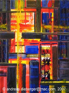 Today we did the follow-up to Tuesday's grid exercise. Just as reminder, the idea is to play with depth and space. On Tuesday we did that just with value. Now we add also color. And to make things a bit more interesting, we use only primaries, in my case I used CadYellow, CadRed and Ultramarin. I was tempted to add a cool red to the mix but resisted temptation (the blue was a warm tone, so I had three warm toned colors).
Here is the result of that one. At first I actually didn't like the piece at all - it seemed too chaotic. Then I stepped farther back and took a break and I saw more merit in the piece. I did do some changes at that point that didn't really change the image much but just heightened some focus here or there and the result is much stronger than it was before. So now I actually like the piece.
This may not be visible on the small photo but this was painted on illustration board that was primed with two layers of gesso (sponge roller) which gives a very interestingly textured surface. This enabled me to do some fairly interesting sgraffito work on the piece. In some areas one can see that there is some form in red and yellow that was covered up with blue and then the blue was slightly scraped away which makes the underlying form shine through in little dots here and there. A nice effect that I quite like. This effect is best visible at the far right about half-way up the piece.
 First of all - a reminder that this week and only this week I am showing 6 prints at a SJSU show. Gallery 3, art building, San Jose State. Reception is Tuesday night. Here is a photo of the 6 pieces I'll show there. Among them the print I'm discussing in this blog posting. See also previous blog post. It's a really beautiful show - not just because I have stuff in it, but because it's all really really good work. Here is a photo of the setup in my corner. The lighting hasn't been finalized in that photo yet, obviously. Anyway, come by and check it out live! 'nuff said.
 And then there is a technique which I call "puzzle print" although I'm sure that is the official term. The idea is that the printing plate gets cut into smaller pieces. These are inked individually, then put together like a puzzle and then printed. Rinse and repeat. This posting describes my experiences with this technique.
 So now I had all the parts I needed (and I even aquired a set of kevlar gloves for woodcutting, in the process - very handy - pun intended). I sketched out my design and then came the next problem... Cut the plates first or saw the plates into puzzle pieces first? It was late at night when I faced that decision and I didn't want to wait to call Bernie so I decided to saw the plate apart first (I really wanted to try that fret saw ;) ). In hindsight that was the second best way to do it (out of two possibilities). The reason is, that my design had a few very small and narrow spots and it was much harder to cut the design on those pieces because I couldn't really hold the plate well. Oh well, live and learn.
 The resulting print came out nicely and I'm glad I chose the relatively muted combination of colors you see in the final print. So what about the plates? Well... the experiment worked almost as well as hoped, but not 100%... there must have been a few micro-cracks in the shellac because in a few places there are traces of the ink on the plate that just don't come off. I might still go with the idea to mount the plates as a separate art piece. Or I'll just make a new set of plates. Oh well.