Tests for yellowing of colors
Just a pointer today... I discovered this interesting web page where somebody tested paints for yellowing over a 5 year period. I haven't read all the notes yet, but it definitely sounds interesting - just the kind of stuff I'd do. Well, actually I have done something like that for printing inks and for my acrylics but I waited only a few months and left the samples out in bright sunlight, partially covered with multiple layers of aluminum foil. My results were that over the period I tested the paints barely changed at all. And that was in brightest sunlight in the California summer. So, really, modern paints are quite colorfast.
Anyway, here is the pointer to the site I found about yellowing of paints. What I miss on this site is a comparison of "after drying for 5 years vs. freshly painted". How else can you really compare when you don't see the two color samples next to each other in the same photo?! But the notes are still interesting.
"After Katrina II" Linocut
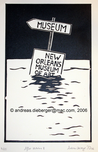
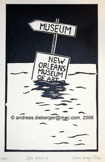 I just finished printing a little linocut for the Florida Printmakers Print Exchange. The subject matter might appear a bit macabre, but the print was inspired by a photo I saw in ArtNews. As a matter of fact, the New Orleans Museum of Art itself suffered only relatively minor damage during and after Hurricane Katrina because, luckily, that building stands on a slightly higher elevation than most of town. So while signs guiding you to the museum might indeed have been mostly submerged, the museum itself wasn't.
This print is "After Katrina II" because I made a first version for the letterpress class I'm taking at foothill college. As so often, when you practice, you get better (surprise, surprise) and "After Katrina II" is -- IMHO -- the much better piece. It is done on a gray linoleum without burlap backing. I keep hearing it's really linoleum, although I have a suspicion that this material is actually some kind of vinyl. It cuts very well but small slivers sometimes don't want to break off and you have to pull them till they snap (the material is sort of rubbery). I found that I can do very exact lines in this material, but it doesn't print as nicely as some of the other linoleum I have.
"Flux" - WorksSanJose annual member's exhibition
 Just for a change, a little bit of advertising...
On March 31st, 7-9 pm (PST) is the opening for the WorksSanJose annual member's exhibition where I will participate. More info is on the WorksSanJose web site. The show will run March 28 - April 22. WorksSanJose is on 30 North 3rd Str in downtown San Jose.
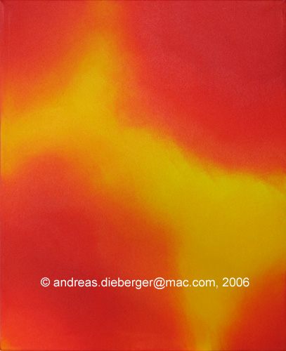
I contributed a painting, acrylic on canvas. It's called "Red-Yellow #2" which is maybe not the most innovative name I ever came up with but it describes the piece pretty well. This piece is from a series of experiments where I limit myself to just 2 colors (red and yellow in most cases). They are abstract pieces where I experiment with color and composition. This particular piece uses fluid acrylics and I wanted (and I think achieved) an effect where the painting appears to glow from the inside. It's done by applying many layers of thin glazing. I think the piece came out quite well. If you live in the area, I hope you can come see the exhibition. There is lots of pretty cool stuff there :)
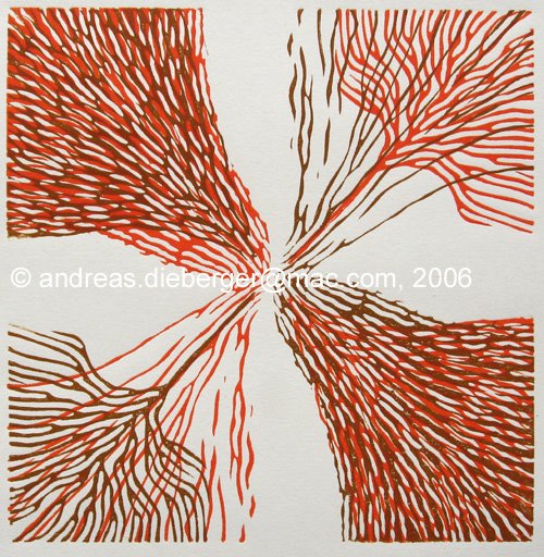
A different spin...

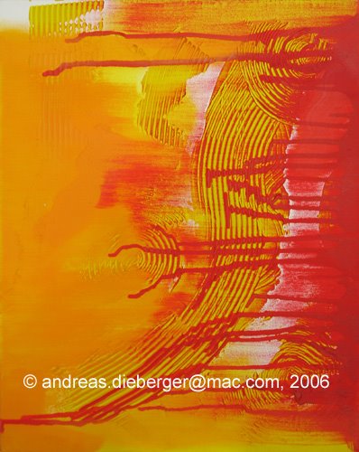
 I was busy these last few days because I also finished a print I was working on for quite a while. It's called "A different spin" because it's based on a very simple idea: take one abstract design and print it several times, rotating the plate 90 degrees each time. Of course there are tons of possibilities. Should you use transparent inks? Opaque inks? Go from light to dark or the other way? To play with the idea a bit I actually scanned the first print and then experimented with 4 copies in different photoshop layers, tuning transparency and hues. Very interesting indeed.
Here is the final result. Aaactually, there are two versions of the print because guess what happened... I forgot the print in the scanner (big surprise there, right?). And I noticed this only after I had finished printing the second layer and had completed cleanup. *harumpf* I decided to call it a "lucky accident" and that print got only a second layer, rotated 180 degrees. I really like both versions. The 2-color version has a very different feel to it because two of the four quadrants of the plate were deliberately thinner, and more line based. By rotating the plate 180 degrees you get the two "heavy" and the two "light" quadrants combined which is a very interesting effect that is lost in the 4-color version.
PS: Most of my postings are done using Arial, but this time I'm using Verdana in honor of Matthew Carter. For the letterpress class I will give a short talk about Matthew in two weeks. For those of you who are not into typography: the font Verdana (like many other famous fonts, such as Bell Centennial) was designed by Matthew Carter.
post scriptum..

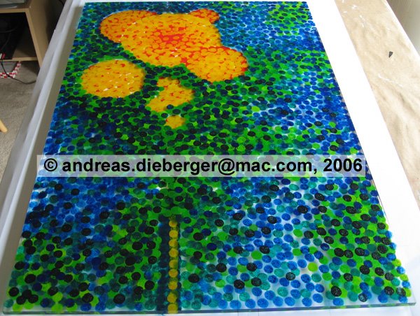
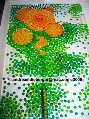
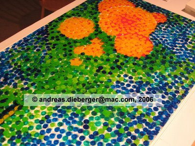
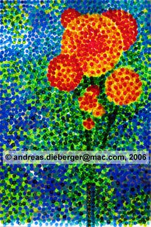 When I stared at the plexiglass plate over my breakfast muesli I realized more and more that the background was just too overpowering and needed to be toned down a bit. So I went over the thing once more. About 10 different layers of colors later the thing looks like this. Yes, there is definitely layering in these pieces. It's most noticeable if you look at them in reflective light, not when the light shines through them. The trick to control subtle color mixture is to partially overlap the (very evenly sized) dots. By partially overlapping two dots you get three differently colored areas. I typically work from light to dark through the main colors I use on these (light and dark yellow, red, green and blue although on this piece I used also a lot of mixed colors -- the bright background consists of at least 5 different greens). Then I either go the same sequence reverse so that yellow may end up both at the bottom and top. Once through those two series I work less systematically and fine-tune the piece where I feel it needs darkening / lighting up. The whole process involves a lot of squinting to assess light/dark values. On this piece I did something for the first time on an acrylic piece: I used (transparent) black to darken a few spots at the very end. Saurat and friends are probably rotating in their graves right now and will come to haunt me in my sleep... :( But the piece just needed it...
Time for a new plexiglass piece...