Bookmark exchange

 I just finished two little prints for a print exchange for bookmarks. The only thing given is the format: 5cm x 20cm. You send 11 prints there and you get 10 different ones back picked randomly from the other submissions. I love participating in exchanges - you see so much cool work form other people that way and you actually build up quite a collection of really nice prints! It's a lot of work, though. Typically you submit just one piece, but some exchanges (like this one) allow submission of more than one piece, so I sent them two. All submissions will eventually show up on their web site (where you can see the submissions for previous years as well). I'm totally curious what I'll get back already :)
Here is the web site for the exchange.
silver lining...
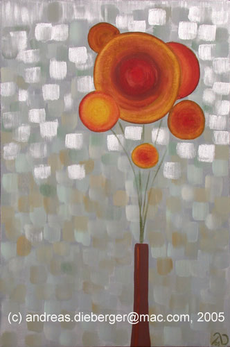
 It has been a while since my last posting and it's time for an update. I actually finished several pieces in the last few weeks and here is one of them that I find particularly interesting. It is done with oil paints I ground myself and just a tad of commercial cadmium red to beef up the main flower. Normally I don't use a lot of silver in my paintings, but this time I did because - well - I made the color so I wanted to see how well it worked. It takes quite a bit longer to dry than the other home-made colors (earth tones dry particularly fast and silver seems to be pretty slow in comparison).
I was playing a bit with contrasting colors there. for instance the background has quite a lot of green in it to create a contrast to the red flowers. I noticed that if I use the silver paint regularly thin (with quite a lot of medium, as I normally do on these pieces), it actually is a metallic gray but not really silver. I really need to use the silver mass tone to get the real silver effect as I have towards the top of the piece.
I used my regular medium that I mix out of linseed oil, dammar and turpentine. Since I did that I read on the Gamblin home page that you should not use turpentine with their silver paint (which is also made out of aluminum powder, just like mine). I wonder why that is. Does anybody know whether there are any bad interactions between turpentine and aluminum?
Project your slides...!
I have a confession to make... I feel quite stupid right now because I *should* have known better. The thing I'm talking about is slides for submissions to competitions, exhibits, galleries etc. Of course we all know (right, RIGHT?) that you cannot just take slides and look at them on a light table, even with a good lupe and then submit them. You HAVE to project them, because that's also how the gallery or the curator will look at it. Of course we all know that. Every book on the business of being an artist will tell you.
But of course when you are just starting out you may not have a projector and you are submitting the stuff "just for fun" anyway, or you are not seriously expecting anything anyway, (fill in your favorite excuse) etc etc. And a slide projector costs some money too (I'm foraging on eBay for a while already and all decent looking ones seem to be $70-$80 plus shipping. Not that much, but still money, especially if you know you'll use it only once or twice a year.
Anyway, finally I thought of just borrowing a projector and to look at my slides. I submitted slides several times now and all got rejected, which is not unusual. It is a frustrating experience till you finally get accepted somewhere. Of course after the 5th or so rejection you wonder what you could do better. From the notifications you know that only a small percentage of submissions gets accepted anyway so getting rejected doesn't mean your stuff is bad. It just means that other stuff was submitted that was either even better or that just fit the show better. But eventually you wonder... are the slides the problem, maybe?
In any case, I finally had a chance to look at my slides. And believe me: they look p-e-r-f-e-c-t on the light table. But on the wall... hmmmm.... o-my-o-my... One of them was slightly out of focus on the edges. Another one seems to have had a hair on the lens when I took it, the next one seemed to have a couple of specks of dirt on it. And so forth. I won't bore you with a whole list but just give you the summary: the slides were mostly OK, but none of them was perfect. And that's just stupid to send a non-perfect slide to a show because these little things distract from your piece. I want the curator to focus on my print and not on the speck of dirt. And most of the slides that get submitted are probably perfect so an imperfect slide will stand out - but for the wrong reason.
So considering that I spend about $30 per submission on average (for submitting 3 slides) + the time and money for packing and mailing + all the work a submission requires it seems that the investment of a $100 slide projector is not such a bad deal if it makes it more likely that my art gets assessed by the curator and not the amount of dirt floating around my appartment when I take the slides. I guess the next time I see a decent looking projector on eBay I will finally click that "bid" button...
What I like about painting on acrylic glass
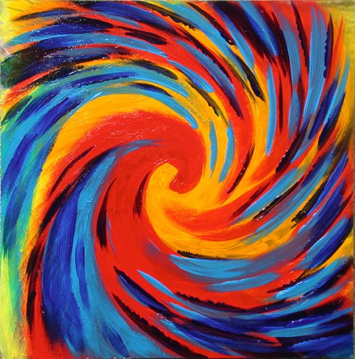
I have done a couple of pieces on acrylic glass by now, all of them abstract and most of them in a pointillist style. There is something really cool about this technique and that's what I want to talk about here. First of all, if the sunlight shines through these plates they really light up with colors and that's a totally cool effect. But there is another aspect of these pieces that I find intriguing. Because I typically put paint on in several layers (even for the pointillist stuff) the painting looks different depending on whether you look at it from one side or from the other, which you can do because the support is transparent. So you really get not one, but two pieces. And even better, if you let light shine through the piece you again get two different pieces depending on what side is up. And the whole effect can be even more interesting when you paint the acrylic sheet on both sides and don't paint parts of the glass. Now imagine a really thick plate, or (goodness) two plates mounted a few inches behind each other (Victor Vasarely experimented with something like that too, I know) the painting changes again depending on the viewing angle. Very very cool stuff.
Here you see on of my pieces on acrylic glass. It is painted on only one side of the glass and still you get very different results depending on whether you look at it in reflective light or if light is shining through it.
I plan to experiment more with this. Among the things I want to try is to use a really thick plate (I have a 1 inch plate here for that purpose but am saving it till I know exactly what I want to do as the material is a bit pricey).
By the way: For the early pieces I used heavy body acrylics, so you get a bit of a 3dimensional structure as well. On the newer pieces I'm using fluid acrylics. I also experimented with flow medium and then manipulating the wet paint by blowing on it or using a can of compressed air. I noticed that the acrylics with flow medium stay tacky forever on the acrylic glass (maybe I used too much?) So they attracted fingerprints and dust. Not good. In any case, the acrylic paint seems to stay too soft even after a long drying time. I use Krylon UV resistant Acrylic coating (glossy) on the plates once they are dry and that gives them a harder and more solid surface and protects the paint film against scratches.
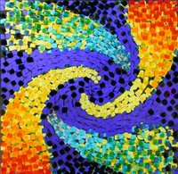
Below are a few more examples:

 Now if anybody could tell me how to keep those images from being aligned like a staircase I'd very much appreciate it...
My first sale! :)
OK, maybe one shouldn't admit this so openly but my first piece just sold :)
I donated one copy of my print "Abstract Grid III" (a 2 color linocut) to the annual benefit auction at WorksSanJose and it sold! I'm very happy about that. Especially as the print was lot #1 at the auction which is always a tought spot to be in. And, unfortunately, plenty of pieces didn't sell. So I'm especially happy. It's always wonderful to hear people say how much they like or even love your work, but when somebody actually spends money on your piece it is even stronger feedback for you as an artist.
The print is on my web site in the printmaking pages
cheap supplies - part 2
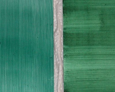
 I just looked at those two art boards that I prepainted the other day (see previous entry) and I almost couldn't believe my eyes! Yes, one of them was much harder to paint, sucked up paint etc. etc. But now look at this. Now that the paint is semi-dry they don't look anything alike! One panel clearly has a much warmer tone to it than the other. And I used exactly the same paint for both. One might have gotten a little bit more, but otherwise the same paint. You can see from the uneven strokes on the right board that it was hard to put a consistent paint layer on (actually, towards the end I sort of gave up and decided to try to fix this on the next layer)... But gee, what a difference!!!
It's not worth buying cheap supplies
I knew it for a long time, but of course when you look at the price of your shopping cart in your online order you sometimes decide to go with the less expensive stuff anyway, or you think that "just for this experiment it doesn't matter". Well, sometimes it does even though most inexpensive art supplies are actually quite decent.
For quite a while now I wanted to paint something on gessoed board instead of on canvas. So I got some inexpensive gessoed art board "ultra-smooth, primed and ready". Essentially masonite painted with gesso. No rocket science, right? Well, I started putting some "imprimitura" on two of these boards, essentially a toning layer. One of the boards took it nicely, it was very smooth and took the paint well. The other one, though, sucked the paint away like a sponge and it was almost impossible to get a semi-consistent layer of paint on that thing. They looked the same, they were labeled the same, the cost the same. For all practical purposes they were the same, but obviously from different manufacturing batches. And one batch was almost impossible to use.
I payed probably $5 for each board (small 11x14" ones) whereas a higher quality board would have cost maybe $10+. And I've wasted at least half an hour trying to make the paint layer look ok, but might end up throwing the board out. So I didn't save money, but just wasted time, money and paint.
That really IS the reason why I prime most of my painting surfaces myself. Then I know what's on the material, and if something doesn't work right then I know who to blame.