4 color lithography - done!
Puh - finally it's done. Last week I spent 3 long afternoons/evenings to finish the 4 color lithography I mentioned in the last post. And I'm delighted to say that I messed up only one print, so I have an edition of 9 and 3 progressive proofs. And I have one more weird war-story to tell about print making (because the one print that got messed up did so because of a moth interfering with the print. On the first roll I managed to avoid it, but it circled back to dive-bomb the ink roller and on the reverse inking rolls it hit the roller and messed up the print *sigh*)
As I'm sitting at the CHI 2007 conference most of this week, I don't think I'll be able to post the final result till the weekend. So stay tuned for my next update. And then I have 2 more 2-color prints ready to be printed in my locker so you'll see more lithography before this term ends (in mid May).
Ambitious litho project
Here is a short note about a project I'm working on in Lithography, and one of the reasons I haven't posted much about my litho work lately. I set my mind on doing a 4-color print in my "different spin" series. Those consist of a square plate with abstract pattern printed several times, rotated, on top of the same piece of paper. So there is less plate and drawing and etching work, but it's still a serious project because printing a litho plate is so time consuming... especially when you try to print in light colors (as I am).
So said plate was stitting in my drawer for over a month and I decided to do that other 2-color print first before I might mess this one up (and I'm glad I did that - I learnt a lot since then as you can see from the last 2 or so litho related posts). I hope I'll be able to avoid all of those mistakes.
Yesterday I finally printed the first color - yellow. And it came out very nicely. I did 13 prints which is good for an edition of 10 + 3 progressive proofs (or, if I mess something up, it will be a 8 print edition and 2 duds or something along those lines). Yellow is tricky because - first of all, you cannot use asphaltum for rub-up - instead you use the printing ink, thinned with Lithotine. And the press station has to be super extra clean which takes a lot of extra care and work. But all worked well and so next Tuesday (I hope) the next color will be printed over that. At that rate, the print will probably be done in about 2 weeks, considering I can only print really long printing sessions (we are talking 4+ hours each time) on Tue or Thu.
In other news: I'm also working on a stone again for a change and that project is a 2 color print from the same stone - I want to do some reductive work on the same drawing on the stone - just to learn that technique as well. Busy busy busy :)
It must be tax time...
...which would explain a certain lack of postings here, lately. And guess what: I just hit "send" on my eFiling and within mere minutes I logged into blogger to bring the world news of new art. Now isn't that something?
Ok, you can all stop applauding and cheering now.
 Here is some art I did sort of in a rushed late night session this past week. Works San Jose had its grand re-opening on Friday (for more info see http://www.workssanjose.org/)and for that occasion members were asked to contribute to a large collaborative art thing/happening/event/doodad for lack of a better word. Essentially, everybody creates art on 16x16 flat panels (cardboard, typically) that can be hung from two nails. 4 of these go on top of each other and the top one represents head and shoulders, the one below the torso, the next the midsection and the bottom part the feet of some figure representing the diverse membership of Works. It doesn't have to be figural but can be abstract, metaphorical etc etc.
There is not much more guidance and planning beyond what I just wrote, which is the beauty of it. Intereresting combinations of art are bound to emerge from that. And the whole goal of that? Create a ton of these and all of them will eventually be auctioned off on eBay as fund-raiser for Works! They come in full body sets (4 panels).
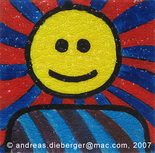
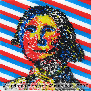
 So for this I sat down and made 2 panels on plexiglass. Both of them were painted in a way, that you can look at them from either side. One of them is a smiley the other is a George (as I happened to have a dollar bill at hand, which is gone now that I paid my taxes, by the way). They are both painted only on one side! So there are 3 layers of paint on them, one of them a separator layer between the images. In the case of George, the face is done in a vaguely pointilist style so you can actually see right through him. The tag line for that one could go like this "this is george - you can see right through him. On the one side he is all about money, on the other side he is all about flags" ;)The smiley face doesn't have such a deliberate / fun message. Essentially a happy smiley on one side (but a bit fuzzy because I used textured plexi). On the other side he is not quite so happy looking, but less fuzzy (can't have everything in this world, I guess).
Well, there we go.
Another abstract grid piece
 I seem to have fallen in love with these abstract grid pieces. Or rather, I should say "pieces developed out of the grid exercise". So, here is another one that I made on Tuesday. This time, I took photos of two intermediary stages so you get an idea how the piece evolved.
I also experimented with mediums. I like the effect of cold-wax on oil paint because it makes the paint film very matte and velvety (I used that effect also in "The Gap", see posting a few weeks ago). This time I wanted to stess warm/cool and matte/glossy constrasts in the piece so I went for the velvety, matte finish of the wax medium for most of the piece, and then put a very glossy feature on top of that. In addition, the main part of the piece is done in only cool colors and the last feature uses very warm colors as contrast. As you can see the piece was mostly in green and blue at first with a bit of red.
 I felt, the composition was not focused enough. A trick to fix that is to control the light, for instance with black. So the black came in. It's funny but I used to never use black, as I was tought to try to avoid it -- an attitude that harks back to the impressionists, I guess. But it can be very useful for controlling light and focus, as I did on the second stage.
Now, at that point I could have stopped, and I almost did. Layering two wild swashes of intense color on a piece can totally break (or make) it. That's why I took a photo at that point ;) Luckily it all worked out pretty well and here is the final result.

Color lithography
 Finally, the day has arrived when I could finish my first color lithography. It took forever to get to this point because I had these motivational and stress related issues a while back so I didn't make much progress. Then I made a plate for a new piece in the "different spin" series, only to realize just how much can go wrong in a color lithograph, so it probably would not be very smart to start with a 4 color print, even if it's four times the same plate. So I made a 2-color design. Nothing fancy, just some abstract design to learn the process. Then we had spring recess and this week I finally could print the thing.
Now, for color lithography you have to be even pickier with cleaning everything because you really don't want to have any other color on your print, or - worse - get it on your paper before you even have a chance to print. So what I did (picky me) is to completely and very carefully clean the entire print station before I even start. And clean it again afterwards because that's how it should be. That adds time. Then is the issue with getting the ink to have the right consistency which is a lot of work (it took me almost 45 minutes each time this week). So add all of this and you get a solid 5 hour block to print one color. This was a 2 color print, so that's a lot of work. Considering it's really pretty physical labor. And of course this is just for printing the thing.
I had two very good print runs. Everthing worked just as planned, the prints came out really consistent. The registration also worked pretty well and all 6 prints look really identical. One of the plates seems to have been masked a millimeter longer so there is a bit of misregistration but all 6 plates are consistent between each other, so I'm fine with that. It just shows I have to be even more careful next time I plan the print. The print is not the pinnacle of my artistic achievement, but that doesn't matter so much - this was about learning the process. So here it is: my first 2 color lithography.


